Earlier this week I posted 9 location-based infographics showing how and why the mobile world is checking in, not including a series of Foursquare infographics I’ve seen around the web. Foursquare data and how people are using the platform ranges from how many checkins are created by various communities to what if President Obama used Foursquare. It seems people who love createing infographics love Foursquare too therefore I deiced to have a separate post for Foursquare infographics. If you’re a data and/or Foursquare fanboy/lady here are seven awesome Foursquare infographics showing how users are collecting badges and checking in.
1. Foursquare Check-In Analysis: July 11th through July 17th

Via: Trendrr
2. London’s FourSquare Location Data Mapped [Infographic]
![London’s FourSquare Location Data Mapped [Infographic]](http://thenextweb.com/uk/files/2010/08/LDN-foursquare-web21-500x350.jpg)
Via: thenextweb
3. Top 10 Most Popular Foursquare Badges [Infographic]
![London’s FourSquare Location Data Mapped [Infographic]](http://blog.hubspot.com/Portals/249/images//Foursquare_Infographic-resized-600.jpg)
Via: Hubspot
4. INFOGRAPHIC: If Obama Used Foursquare

Via: ReadWriteWeb
5. Ogilvy On: Foursquare For Business
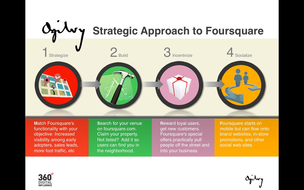
Via: ogilvyprworldwide
6. Foursquare & Central London Transport [Infographic]
![Foursquare & Central London Transport [Infographic]](http://2.bp.blogspot.com/_NDc0-akUurk/TAQGAYaSOwI/AAAAAAAAAdA/YY76zCrLrtE/s1600/Foursquare-Tube-Infographic-%28Non-Pie%29-v2.jpg)
Via: Advertising Aphasia
7. Foursquare vs. Gowalla: Who’s Winning the Geolocation War? [INFOGRAPHIC]
![Foursquare vs. Gowalla: Who’s Winning the Geolocation War? [INFOGRAPHIC]](http://cdn.mashable.com/wp-content/uploads/2010/04/gowalla-foursquare-infographic-640-2.jpg)
Via: Mashable
You can find me on Foursquare here: http://foursquare.com/user/waynesutton